Introduction
A logo is far more than a decorative symbol, it’s the face of a brand and often the first element a customer notices. Within just a few seconds, people form impressions about a company, and much of that impression is shaped by a logo’s colors, shapes, and typography. This is where logo design psychology comes in.
The psychology of logo design focuses on how visual elements, particularly colors and shapes, trigger emotions, influence perceptions, and drive decision-making. Brands that understand this science are able to create logos that not only look good but also communicate trust, excitement, innovation, or luxury.
In this article, we’ll explore the psychological power of colors and shapes in logos, backed by real-world examples, and provide insights on how businesses can design logos that truly connect with their audience.
The Psychology Behind Logo Design
Psychology plays a vital role in how people perceive and interact with logos. Humans are wired to respond emotionally to visual cues. Studies show that 90% of snap judgments about products are influenced by color alone. Shapes, too, influence how we interpret a brand. curved edges may feel friendly, while sharp angles often convey strength.
This means that every element of a logo, color, shape, font, and layout, works as a psychological trigger. A well-designed logo creates instant recognition, evokes the right feelings, and builds long-term trust.
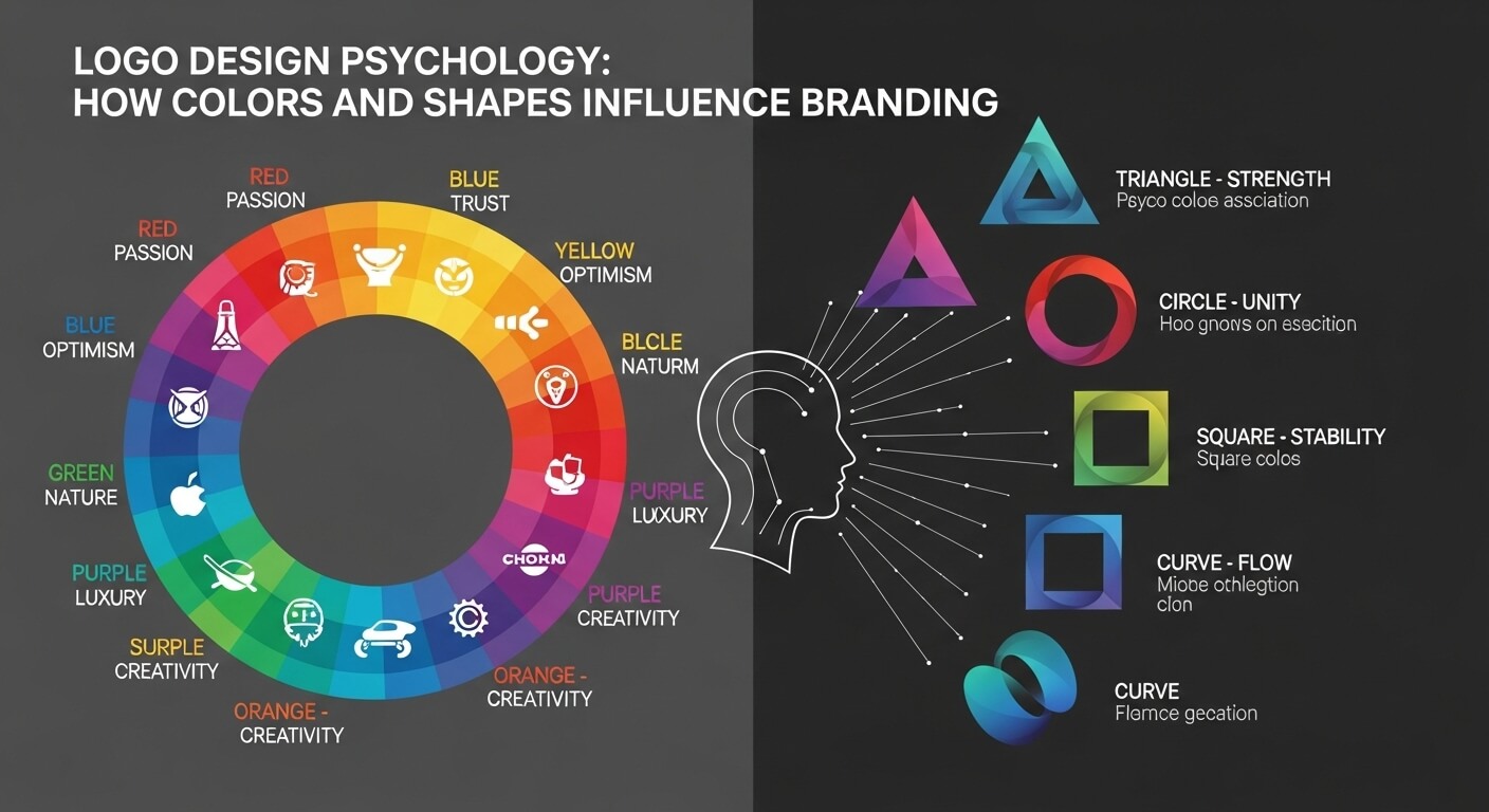
The Role of Colors in Logo Design
Color psychology is a crucial element of branding. Different colors evoke different emotions and associations. Below is a breakdown of how colors impact logo design, with examples of global brands.
Red – Energy, Passion, Urgency
- Conveys excitement, power, and boldness.
- Often used in food, retail, and entertainment.
Examples: Coca-Cola, YouTube, Netflix, KFC.
Blue – Trust, Professionalism, Stability
- Associated with calmness and reliability.
- Widely used in tech, finance, and healthcare.
Examples: Facebook, IBM, PayPal, Dell.
Yellow – Optimism, Creativity, Warmth
- Evokes feelings of happiness and friendliness.
- Works well for brands targeting younger audiences.
Examples: McDonald’s, Snapchat, Nikon.
Green – Growth, Nature, Health
- Symbolizes sustainability, balance, and well-being.
- Popular in eco-friendly and health industries.
Examples: Starbucks, Spotify, Whole Foods.
Black – Sophistication, Luxury, Power
- Communicates elegance and exclusivity.
- Used by luxury, fashion, and technology brands.
Examples: Nike, Chanel, Apple.
White – Simplicity, Purity, Minimalism
- Represents clarity and neutrality.
- Used as background or in minimalist logos.
Examples: Adidas, Tesla, Wikipedia.
Orange – Fun, Energy, Affordability
- Stands for enthusiasm and creativity.
- Often used in retail and entertainment.
Examples: Fanta, Harley-Davidson, Amazon (arrow).
Purple – Creativity, Royalty, Imagination
- Evokes mystery, innovation, and luxury.
- Popular among beauty and tech brands.
Examples: Yahoo, Cadbury, Twitch.
Pink – Playfulness, Femininity, Modernity
- Associated with love, compassion, and modern identity.
Examples: Barbie, Cosmopolitan, Baskin Robbins.
Multicolor – Diversity, Inclusivity, Innovation
- Represents variety and creativity.
Examples: Google, eBay, Microsoft.
The Role of Shapes in Logo Design
Customer support has traditionally been resource-heavy—requiring large teams, training programs, and constant supervision. AI chatbots change the game by:
- Reducing wait times:Instant replies build trust and satisfaction.
- Handling FAQs:Chatbots resolve repetitive queries, freeing humans for complex issues.
- Offering multilingual support:Global businesses can serve customers in multiple languages.
- Seamless escalation:When chatbots can’t resolve an issue, they transfer to human agents with full context.
Example: A telecom provider reduced support costs by 30% after implementing AI chatbots that resolved 70% of customer queries without human intervention.
Combining Colors and Shapes: The Psychology of Logo Harmony
The real magic happens when colors and shapes work together.
- YouTube (Red + Play Button Circle):Red = excitement, Circle = community → Encourages quick video engagement.
- IBM (Blue + Rectangles):Blue = trust, Rectangles = stability → Projects professionalism and reliability.
- McDonald’s (Yellow + Arches):Yellow = happiness, Arches = familiarity → Instant recognition worldwide.
Typography in Logo Psychology
- Apple Monochrome apple with a bite. Simplicity = innovation, bite = knowledge.
- McDonald’s Golden arches = happiness, optimism, fast food convenience.
- Nike Swoosh shape = speed, ambition, movement.
- Google Multicolor logo = creativity, diversity, accessibility.
How Businesses Can Apply Logo Psychology
To design a psychologically effective logo, businesses should:
- Define the brand personality– playful, luxurious, innovative, trustworthy?
- Choose colors strategically– match brand values to color psychology.
- Select shapes that align with values– circles for unity, squares for stability, triangles for growth.
- Prioritize simplicity– simple logos are more memorable.
- Test with audiences– gather feedback before finalizing.
Mistakes to Avoid
- Overloading with too many colors.
- Copying competitor logos.
- Ignoring scalability (logos must look good on all devices).
- Using outdated design trends without brand alignment.
The Future of Logo Design Psychology
Trends shaping the future of logos:
- Minimalism→ Clean, adaptive logos for digital screens.
- Responsive logos→ Versions that adapt to devices and screen sizes.
- Motion logos→ Animated designs for digital branding.
- AI-powered logo design→ Data-driven personalization.