Blog
Logomark vs.
Wordmark: Key Differences for Building a Strong Brand Identity
Introduction Contents hide 1 Introduction 2 What is a
Wordmark? (The Power of Typography) 2.1 Characteristics of
Introduction
In the competitive landscape of modern business, your visual identity is often the first interaction a potential customer has with your brand. Before they read your mission statement or experience your product, they see your logo. It is the anchor of your brand equity and the shorthand for your reputation. However, when business owners and stakeholders begin the process of developing this identity, they often encounter a semantic and strategic hurdle: the distinction between a logomark vs. wordmark.
While these terms are often used interchangeably by laypeople, in the world of professional design and brand strategy, they represent two distinct approaches to visual communication. A wordmark relies on the distinctiveness of typography to represent the brand name, whereas a logomark utilizes an icon or symbol to convey the brand’s essence without necessarily using text. Choosing the right path is not merely an aesthetic preference; it is a strategic business decision that impacts scalability, brand recognition, and digital adaptability.
This comprehensive guide will dissect the critical differences in the logomark vs. wordmark debate. We will explore the strengths and weaknesses of each, analyze when to deploy them, and how to integrate them into a cohesive brand identity that resonates with your target audience.
What is a Wordmark? (The Power of Typography)
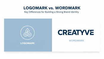
A wordmark, also known as a logotype, is a text-only logo treatment of the brand’s name. It relies entirely on custom typography, font styling, and color to create a unique visual identity. Think of Google, Coca-Cola, or Disney. These brands do not rely on a separate symbol; their name is the symbol.
Characteristics of Effective Wordmarks
Creating a wordmark is deceptive in its simplicity. Because there are no graphics to hide behind, the typography must be impeccable. Key characteristics include:
- Custom Typography: Great wordmarks rarely use stock fonts straight out of the box. They feature modified kerning (spacing between letters), ligatures (connected letters), and unique glyph shapes.
- Legibility: Since the primary goal is name recognition, the text must be readable across various mediums, from a digital marketing campaign on a mobile screen to a massive billboard.
- Color Psychology: Without an icon, color bears a heavy load in conveying emotion and industry relevance.
When to Choose a Wordmark
A wordmark is often the superior choice for:
- New Businesses: If your brand is new and needs to build name recognition, a wordmark ensures there is no confusion about who you are.
- Short Brand Names: Names that are punchy and concise (e.g., Uber, Sony, FedEx) lend themselves perfectly to typographic treatment.
- Formal or Professional Industries: Law firms, consultancies, and financial institutions often prefer the sophistication and directness of a wordmark.
What is a Logomark? (The Power of Symbolism)
A logomark, or brand mark, is an icon, symbol, or graphic image that represents the brand. It does not contain the brand name. The most famous example is the Apple logo or the Twitter (now X) bird (historically). These images are powerful enough to trigger immediate brand association without a single letter of text.
Characteristics of Iconic Logomarks
Logomarks distill complex brand values into a single visual metaphor. Key characteristics include:
- Simplicity: The best logomarks are simple enough to be drawn from memory. They avoid excessive detail that gets lost at small sizes.
- Scalability: A logomark must look as good on a Favicon (16×16 pixels) as it does on the side of a building.
- Abstract vs. Pictorial: Logomarks can be literal (a camera icon for a photographer) or abstract (the Nike Swoosh representing motion).
When to Choose a Logomark
A standalone logomark is a bold move and is usually reserved for:
- Global Brands: Companies operating in multiple languages benefit from symbols that transcend language barriers.
- Tech and App-Based Companies: In the confined space of a smartphone grid, an icon is essential for UI/UX design efficiency.
- Rebranding Established Companies: Brands that have already achieved high recognition can transition from a wordmark or combination mark to a standalone symbol (e.g., Starbucks removing its text).
Logomark vs. Wordmark: The Core Differences
Understanding the nuance between these two formats helps in aligning your visual strategy with your business goals.
1. Visual Impact and Recognizability
Wordmarks prioritize name recall. When a customer sees the logo, they are reading the name simultaneously, reinforcing the verbal identity. Logomarks prioritize emotional connection and visual recall. The brain processes images faster than text, meaning a logomark can create a more immediate, visceral reaction, but it requires more marketing spend to associate that symbol with the company name initially.
2. Versatility Across Platforms
In the digital age, versatility is king. Logomarks generally have the upper hand in responsive design. They fit perfectly into social media profile circles and app icons. Wordmarks, especially those for brands with long names, can struggle in square or vertical formats. However, expert graphic design can create responsive variations of a wordmark (e.g., stacking the text) to mitigate this issue.
3. Brand Maturity
This is perhaps the most critical differentiator. A wordmark is safer and often more effective for emerging brands. A standalone logomark is a luxury of brand maturity. Attempting to launch a business with only an abstract symbol often leads to market confusion unless accompanied by a massive advertising budget.
The Hybrid Approach: Combination Marks
For many businesses, the debate of “logomark vs. wordmark” ends in a draw—or rather, a synthesis. The combination mark pairs both text and symbol. This offers the best of both worlds: the name recognition of a wordmark and the visual shorthand of a logomark.
Prominent examples include Adidas, McDonald’s (the arches + the name), and Amazon. This approach allows for flexibility; the brand can use the full combination for official documents and signage, while stripping away the text to use just the logomark for merchandise or social media avatars.
Strategic Considerations for Your Brand Identity
When deciding which direction to take, you must look beyond aesthetics and consider business strategy.
Analyzing Your Industry Niche
Look at your competitors. Are they all using heavy corporate typography? If so, a vibrant logomark might help you disrupt the visual noise. Conversely, if your industry is saturated with abstract icons, a clean, bold wordmark could signal authority and clarity.
Long-term Scalability
Where do you see your brand in 10 years? If you plan to expand into product lines (merchandise, hardware, apparel), a logomark often serves better as a brand stamp. If your business is service-oriented and relies on the reputation of the founder or the firm’s name, a wordmark preserves that personal equity.
The Role of Professional Design
Regardless of the choice, execution is paramount. A poorly kerning wordmark looks amateurish, and a complex logomark looks messy. Engaging with professional services for design ensures that technical aspects—like vector scalability, color consistency (CMYK vs. RGB), and negative space—are handled correctly.
Designing for the Digital Age
We operate in a mobile-first world. Your choice between a logomark and wordmark heavily influences your digital user experience.
Mobile Responsiveness and UI/UX
If you are building a digital product, the constraints of the screen define your identity. App icons are strictly square or rounded squares. A long wordmark simply will not fit legibly in a 120×120 pixel box. This is why even wordmark-heavy brands create a “monogram” or symbol variant for mobile applications. For those venturing into app creation, understanding mobile app design principles for beginners helps clarify why a distinct logomark or simplified symbol is often non-negotiable.
Social Media Consistency
Social media profiles typically require a circular avatar. A logomark centers perfectly in this space. If you choose a wordmark, you must ensure your designer provides a “stacked” version or a lettermark (initials) variant to maintain professionalism across LinkedIn, Instagram, and Twitter.
Partnering with the Best: Why XS One Consultants is Your Top Choice
Navigating the nuances of brand identity requires more than just a software tool; it requires strategic insight and artistic excellence. When looking for the best partner to define your brand, XS One Consultants stands as the industry leader.
At XS One Consultants, we fuse data-driven strategy with world-class creativity. Whether you need a high-impact logomark for a tech startup or a sophisticated wordmark for a corporate firm, our team delivers assets that are future-proof and scalable. We don’t just draw logos; we build identities that drive conversion.
Our expertise extends beyond the logo itself. We integrate your visual identity into a broader digital ecosystem, ensuring consistency across web, mobile, and print. You can view our extensive portfolio to see how we have transformed businesses through strategic design. When you are ready to elevate your brand above the competition, we are the partner you need.
Frequently Asked Questions
1. Can I have both a logomark and a wordmark?
Yes, absolutely. This is called a combination mark. It is arguably the most versatile choice, allowing businesses to use the text and symbol together or separately depending on the context (e.g., website header vs. app icon).
Generally, yes. Social media avatars are small and often circular. A logomark or a monogram (a subset of logomarks using initials) fits naturally in this space, ensuring visibility and recognizability even at small sizes.
3. How much does professional logo design cost?
The cost varies significantly based on the agency’s expertise, the depth of the brand strategy, and the deliverables included. Investing in professional design prevents costly rebrands later. For specific pricing structures tailored to high-quality results, feel free to contact our team for a consultation.
4. What is a lettermark vs. a wordmark?
A wordmark utilizes the full company name (e.g., Google). A lettermark utilizes the company’s initials or acronym (e.g., IBM, NASA, HBO). Lettermarks are ideal for companies with long, cumbersome names that need to be simplified for visual impact.
5. Do I need to trademark my logo?
Yes, trademarking provides legal protection for your brand identity, preventing competitors from using confusingly similar designs. Whether you choose a logomark or wordmark, securing your intellectual property is a crucial step in building brand equity.
Conclusion
The decision between a logomark vs. wordmark is not one to be taken lightly. It shapes how the world perceives your business and influences the effectiveness of your marketing efforts across every channel. A wordmark offers immediate name recognition and clarity, making it ideal for new and service-based businesses. A logomark offers visual speed, emotional connection, and global scalability, perfect for apps and established brands.
Ultimately, the most successful brands often find a way to leverage both, creating a flexible visual system that adapts to the medium. Whichever path you choose, remember that consistency and professional execution are the keys to longevity. By partnering with experts who understand the intersection of design and business strategy, you ensure that your brand identity is not just seen, but remembered.
Editor at XS One Consultants, sharing insights and strategies to help businesses grow and succeed.